WOMEN’S FORUM
Proposal for rebranding and brand repositioning campaign for Women’s Forum, an international organisation that promotes women's voice on global issues ranging from sustainable development and economy to culture.
-> Role: Concept, Art Direction, Design
Creative Director: Gaëtan du Peloux
Concept & Copy: Francesca Vitello & Laura Aondio
Art Direction: Laura Aondio, Alice Drapanaski, Agata Sienkowska
Motion Designer: Vincent Iweins
Agency: Marcel (Publicis Groupe)
Client: Women’s Forum, 2021

LOGOTYPE
Statement logo with the ‘F’ letter simplified to an equal sign to symbolise that the Women’s Forum’s
activity is all about equality
and inclusion, ideally used in 2 colours to stress the brand’s non-gender approach (contrary to the use of pink or violet colours by many organisations advocating for women’s rights).
BRAND IDENTITY
One of the biggest challenges in this project was how to creatively advertise among general public for an international organisation that is not widely known and the serious causes it is endorsing.
To make the brand and its communication stand out some universal creativerules are proposed:
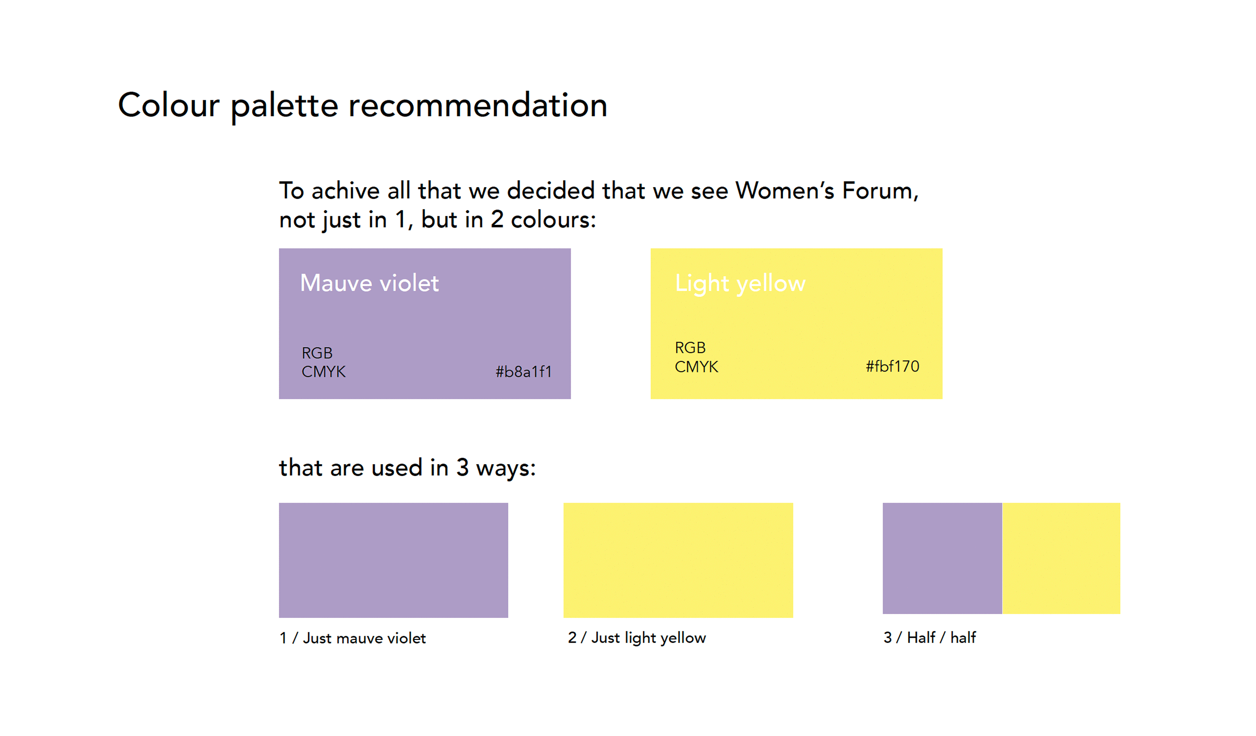
- Interchangeable use of two colours to create a unique and non-gender related style,
- Use of motion design to stress its dynamic & playful character,
- using a clear and bold style of communication that stresses that Women’s Forum is about equality and inclusion.


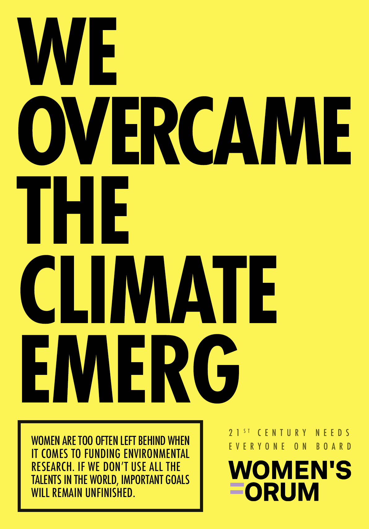
BRAND REPOSITIONING CAMPAIGN
Example of use of the new Women’s Forum branding in the brand repositioning campaign based on typographic posters. They present examples of 3 major challenges of today’s word and draw attention to the fact, that the talents of women are still not enough included in the efforts to solve them.
Concept & Copy: Francesca Vitello & Laura Aondio
Art Direction: Laura Aondio