AIRELLES ESTATES
Brand identity for Airelles Estates, a new brand of Airelles, the French group of the luxury hotels offering exceptional holiday properties for rent.
-> Role: Concept, Art Direction, Brand Identity, Brand Content
Client: Airelles, 2020
Photography : Instagram / Airelles


Brand Identity
Logo based on lettering, with a distinctive style and modern look, so that the brand is not competing visually with the main brand - Airelles.


Visual Identity
Imagined to create an image of a refined and understated taste. Brand imagery composed from artistic and elegant photographs that express modern but luxurious look and feel. Colour palette based on calm beige colours with the accents of yellow or gold.

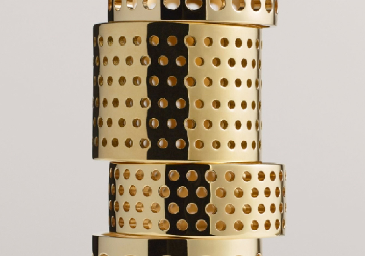
Close ups for decorative
details of the interiors
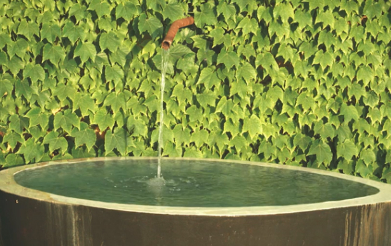
and relaxing power of nature

Apart from the colour photography
- use of the black and white photography
would reinforce the timelessness
and elegance of the brand.

Use of textures - fabrics, food,
textiles, interior design
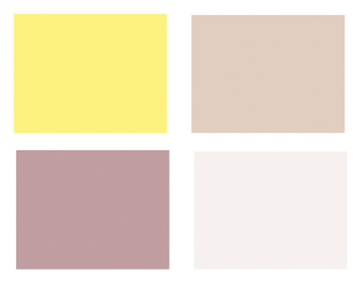
Colour palette for graphical
details and backgrounds
 Idea for showing pictures or memories
 from travel (eg. travel photographs)
Web Design
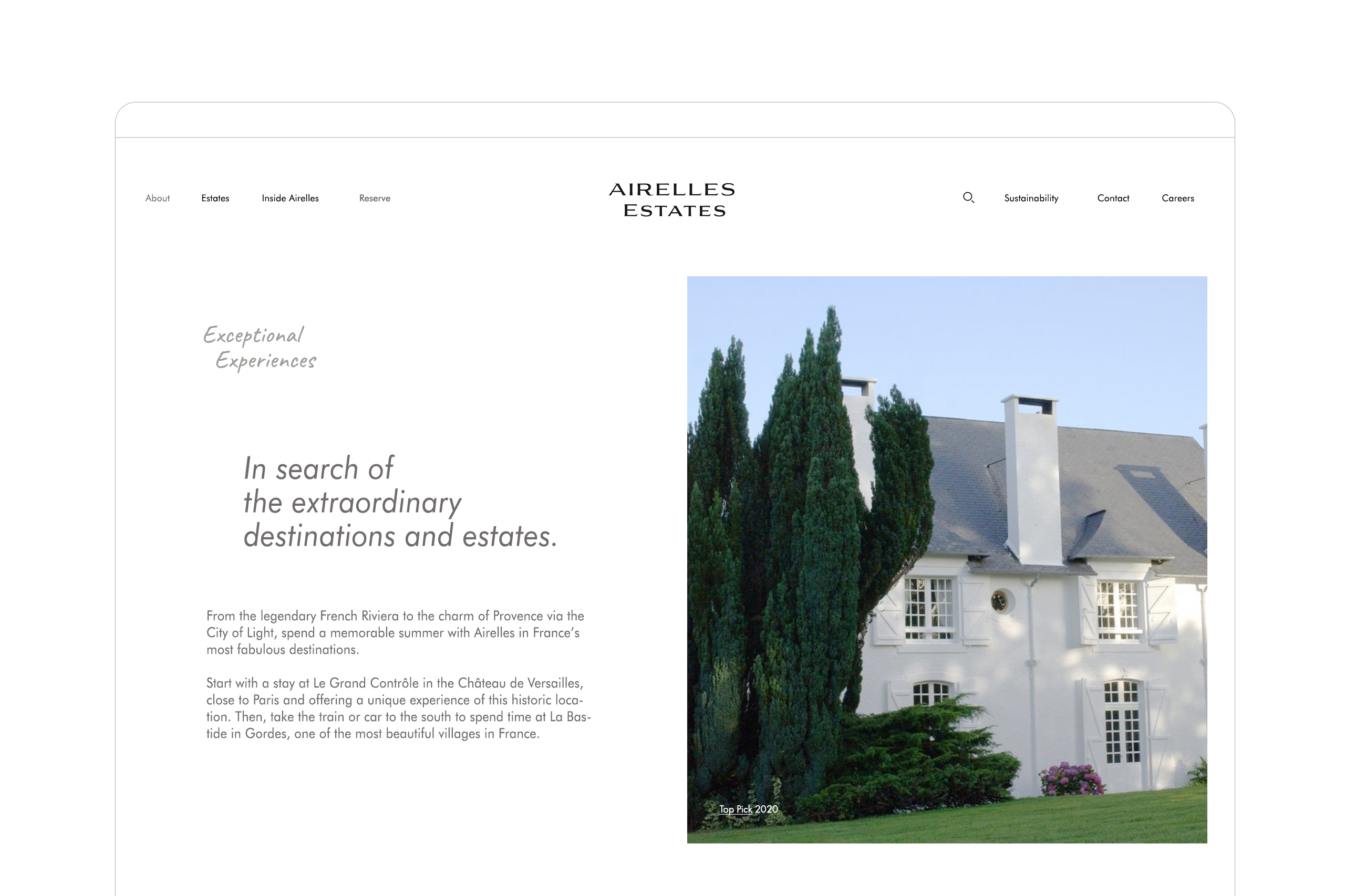

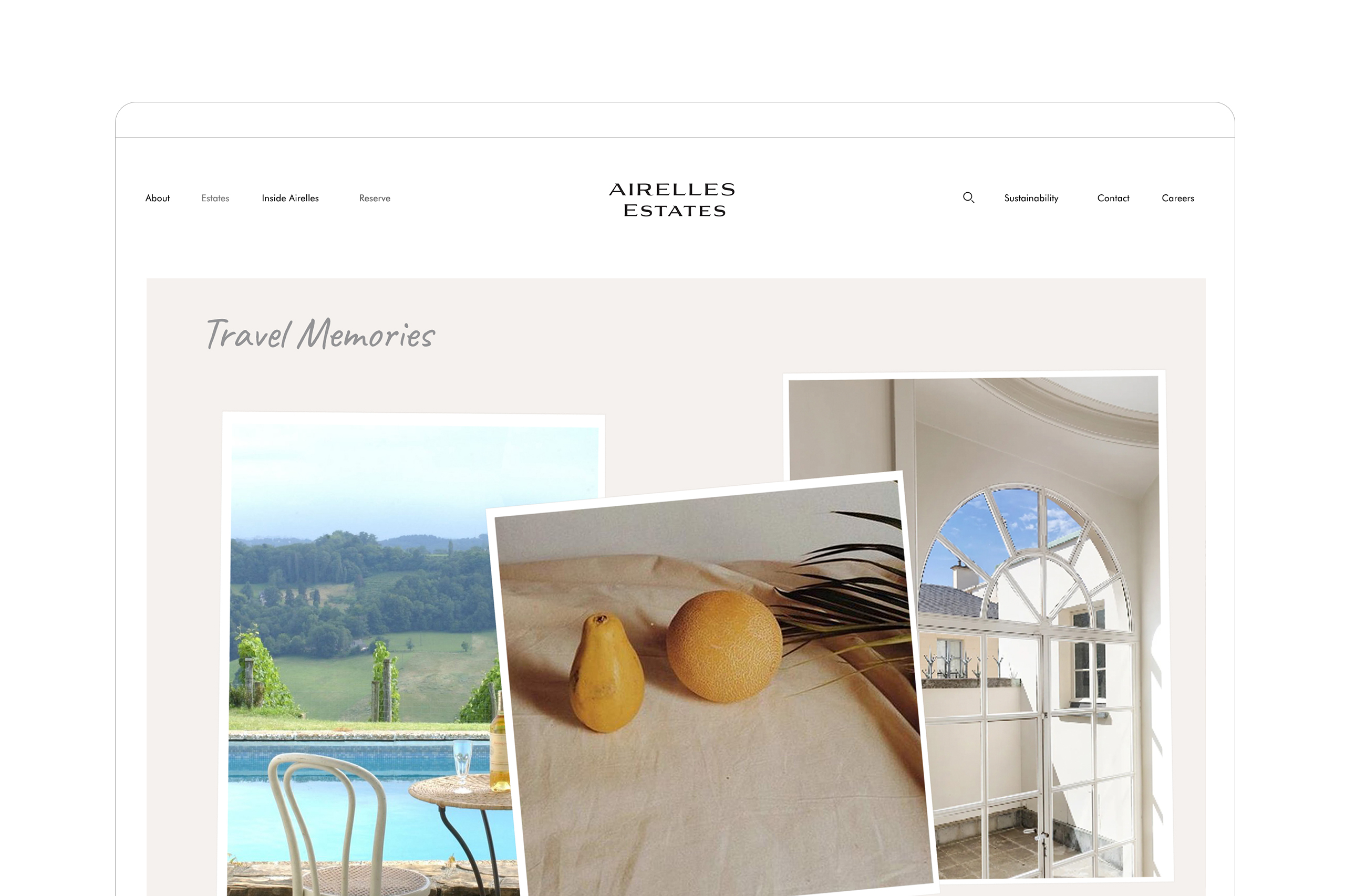
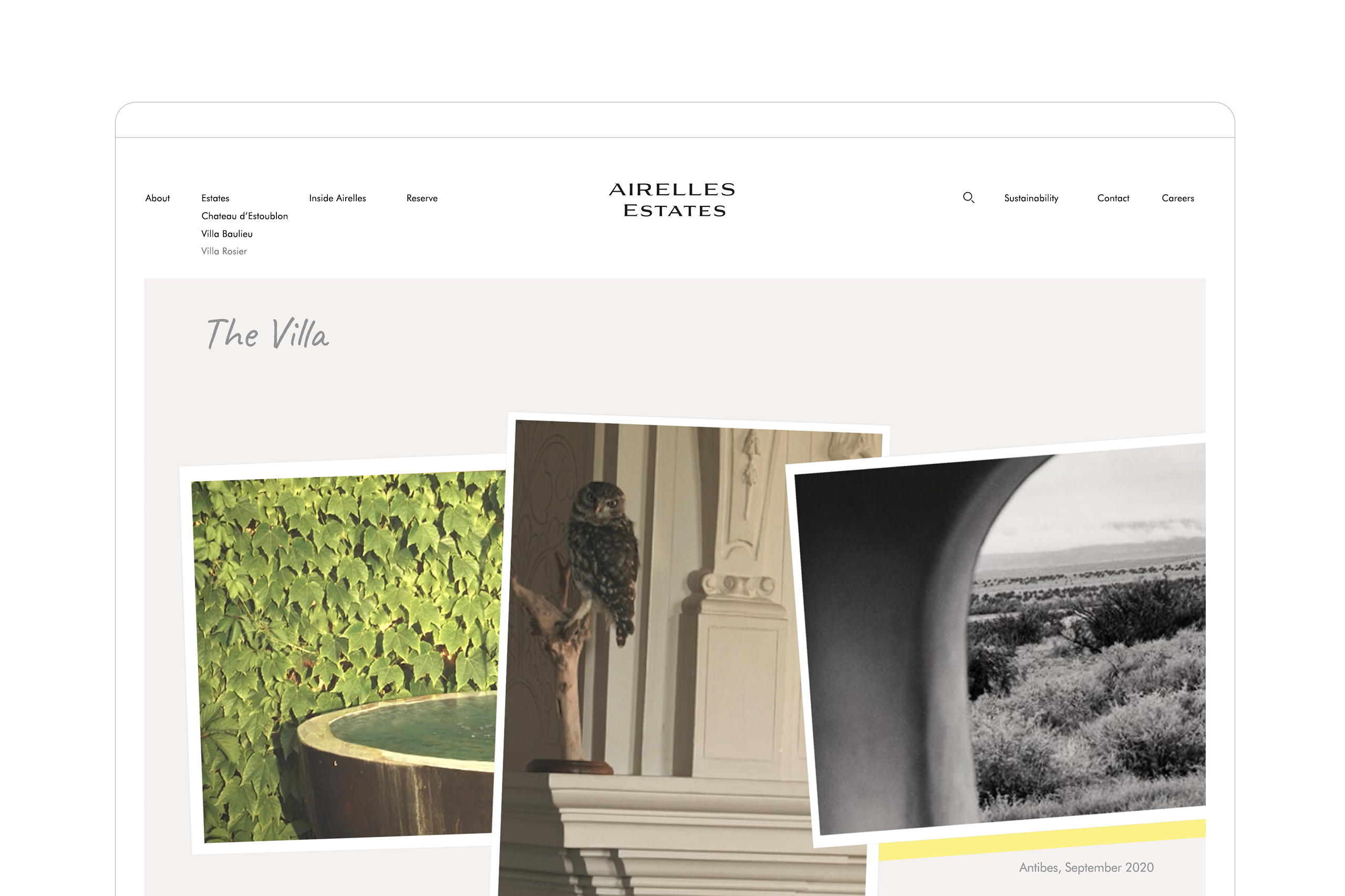
Digital Content
Created with attention to detail to present various lifestyles, decors and travel experiences and, the uniqueness of each of the estates available at Airelles Estates.
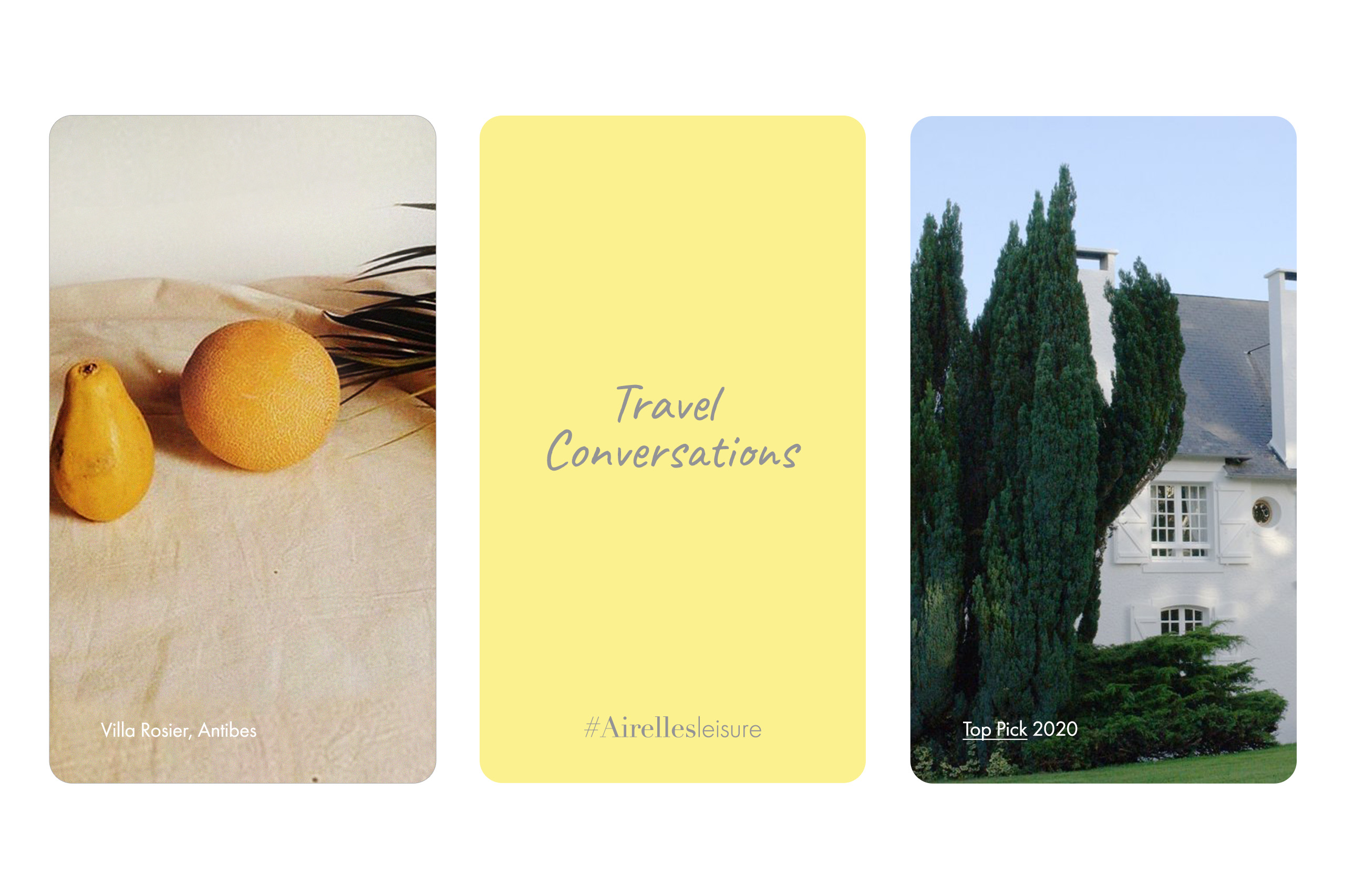
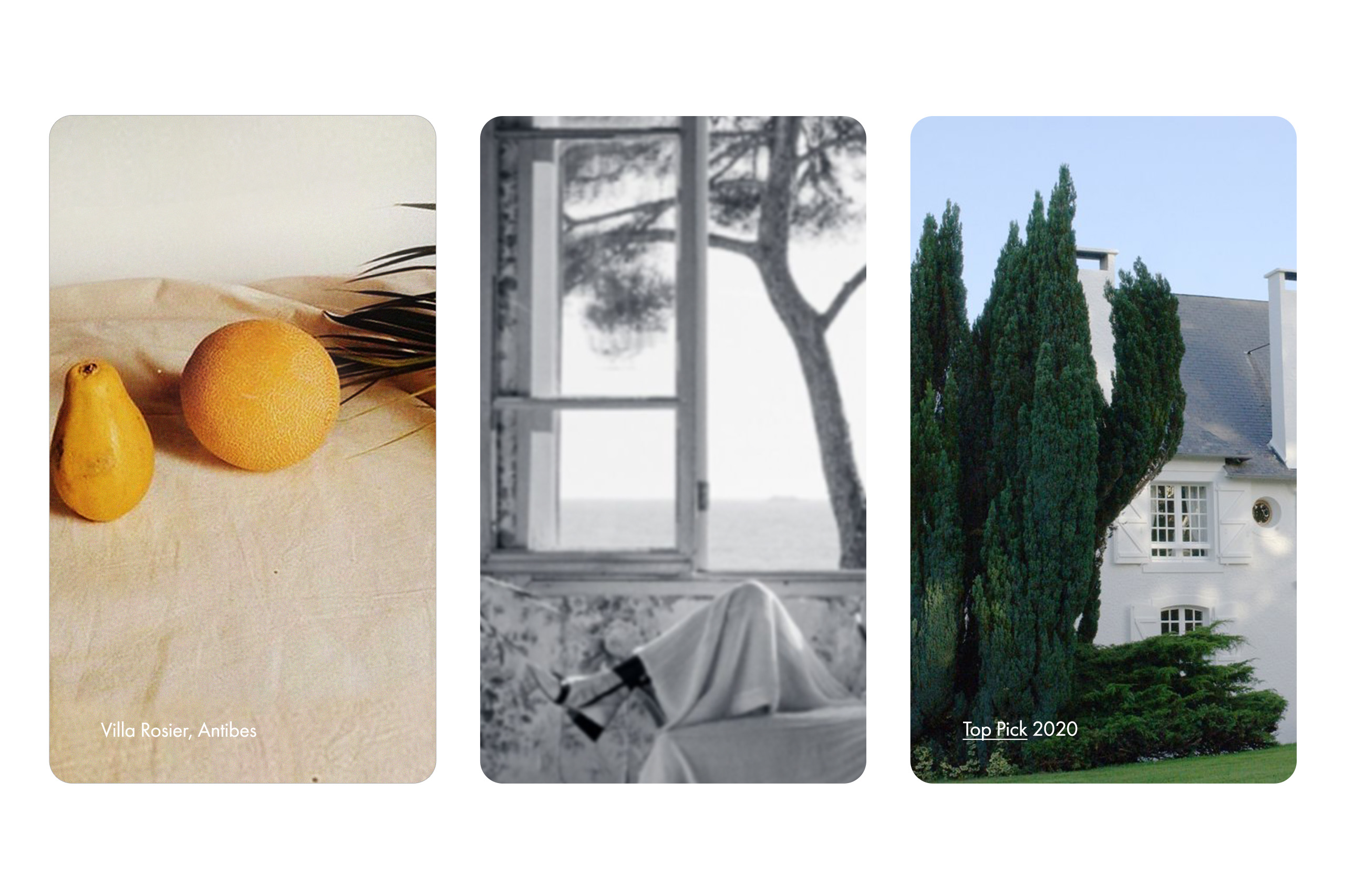

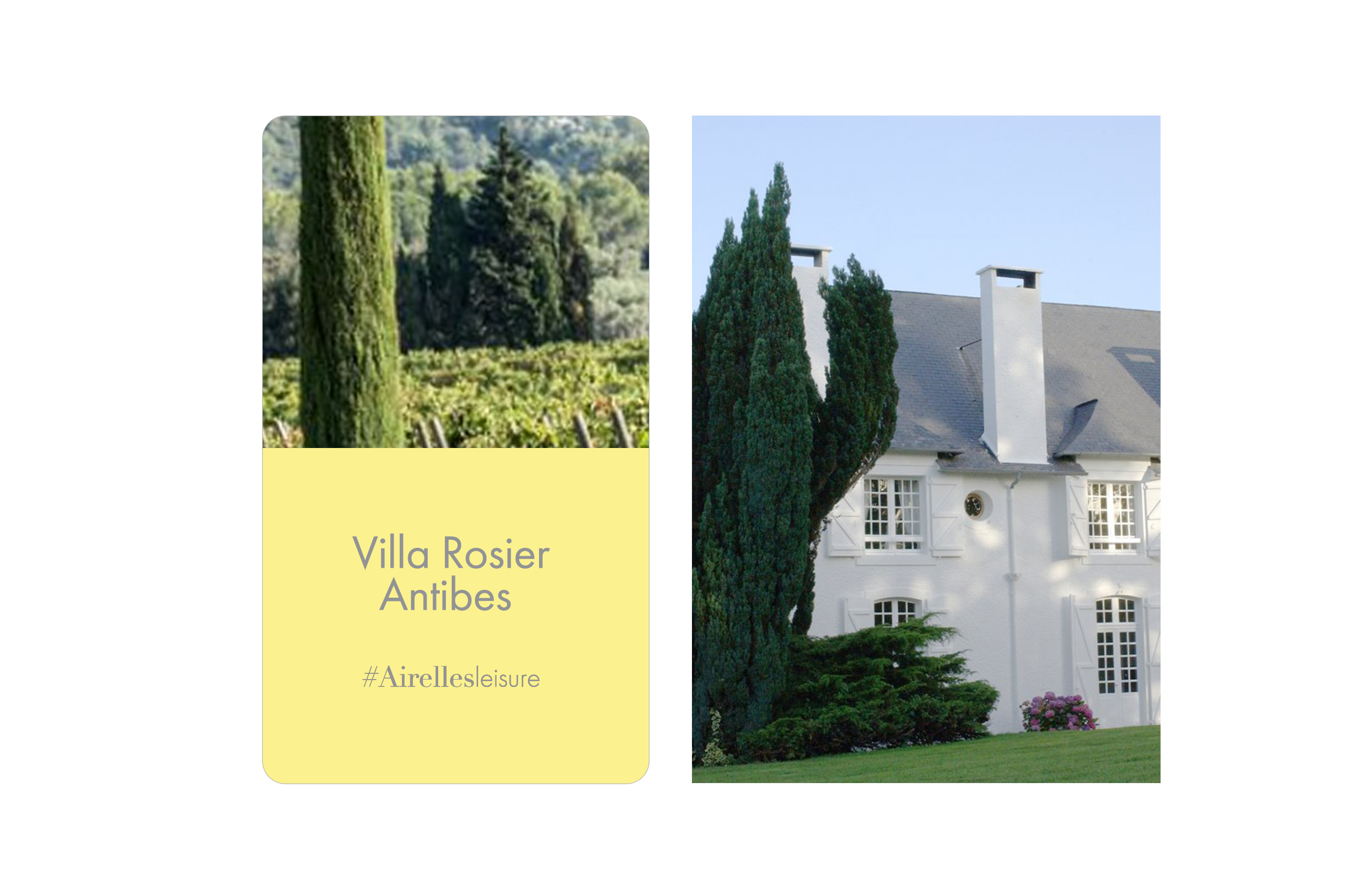
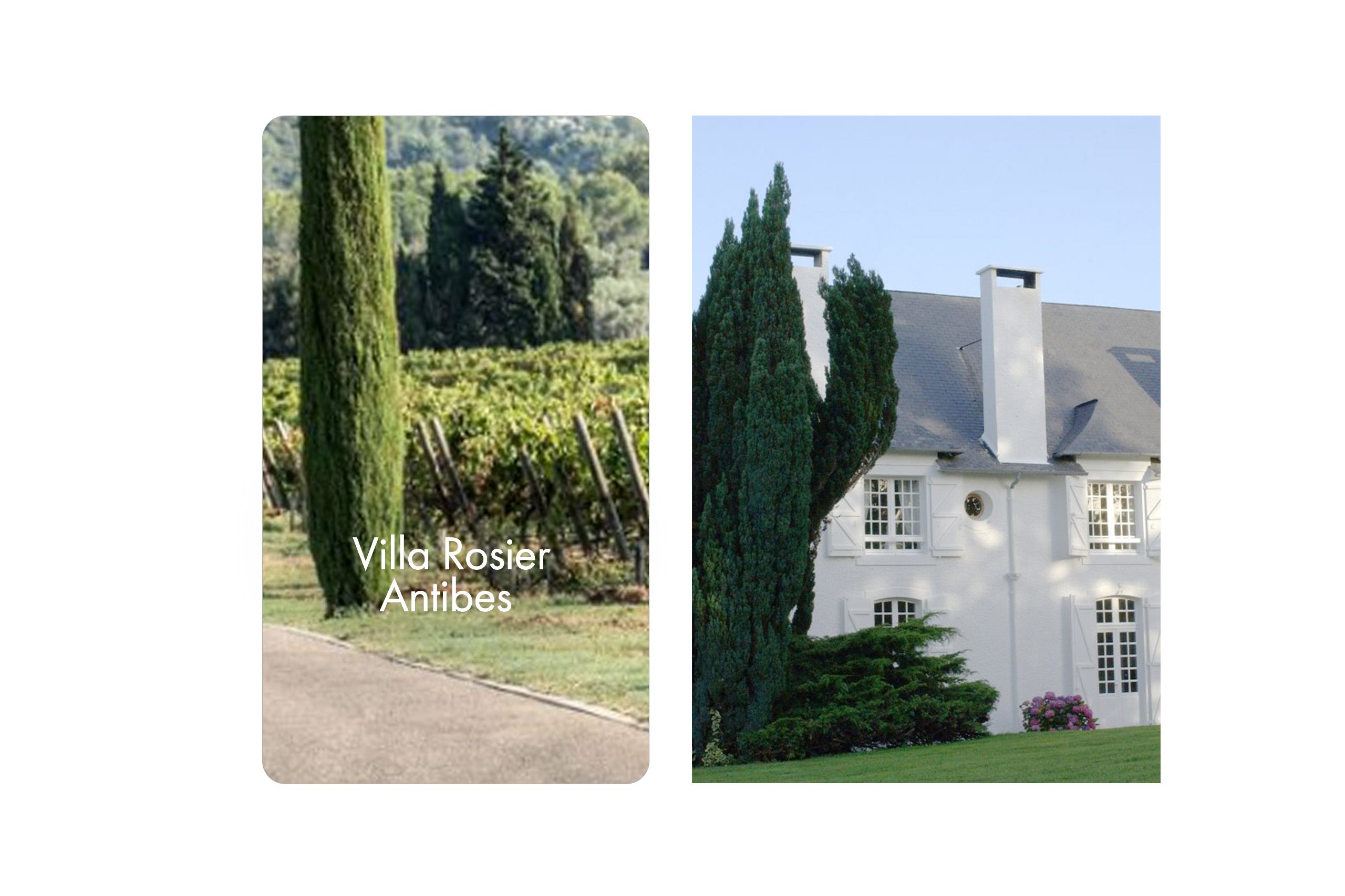
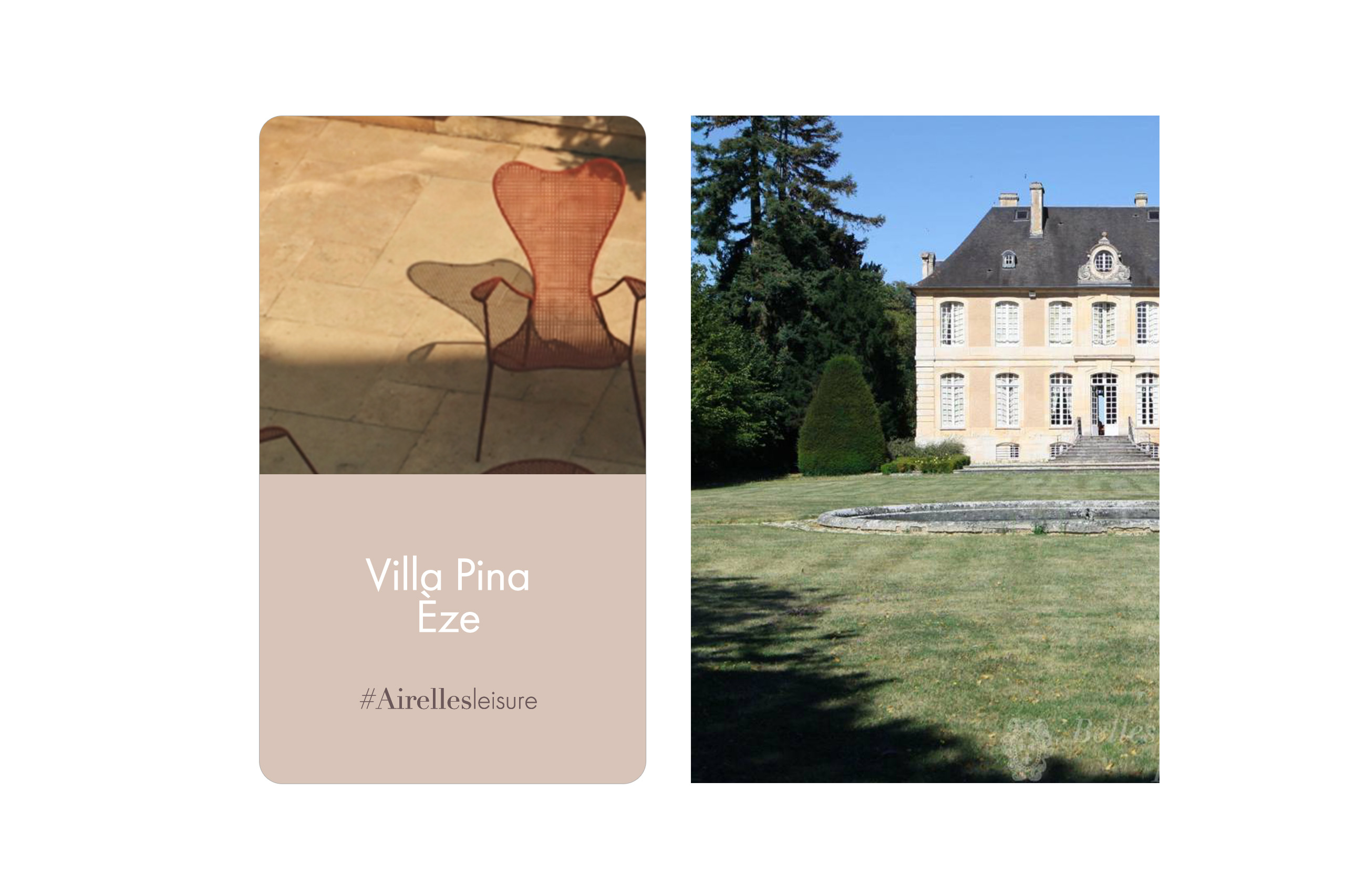

Newsletter
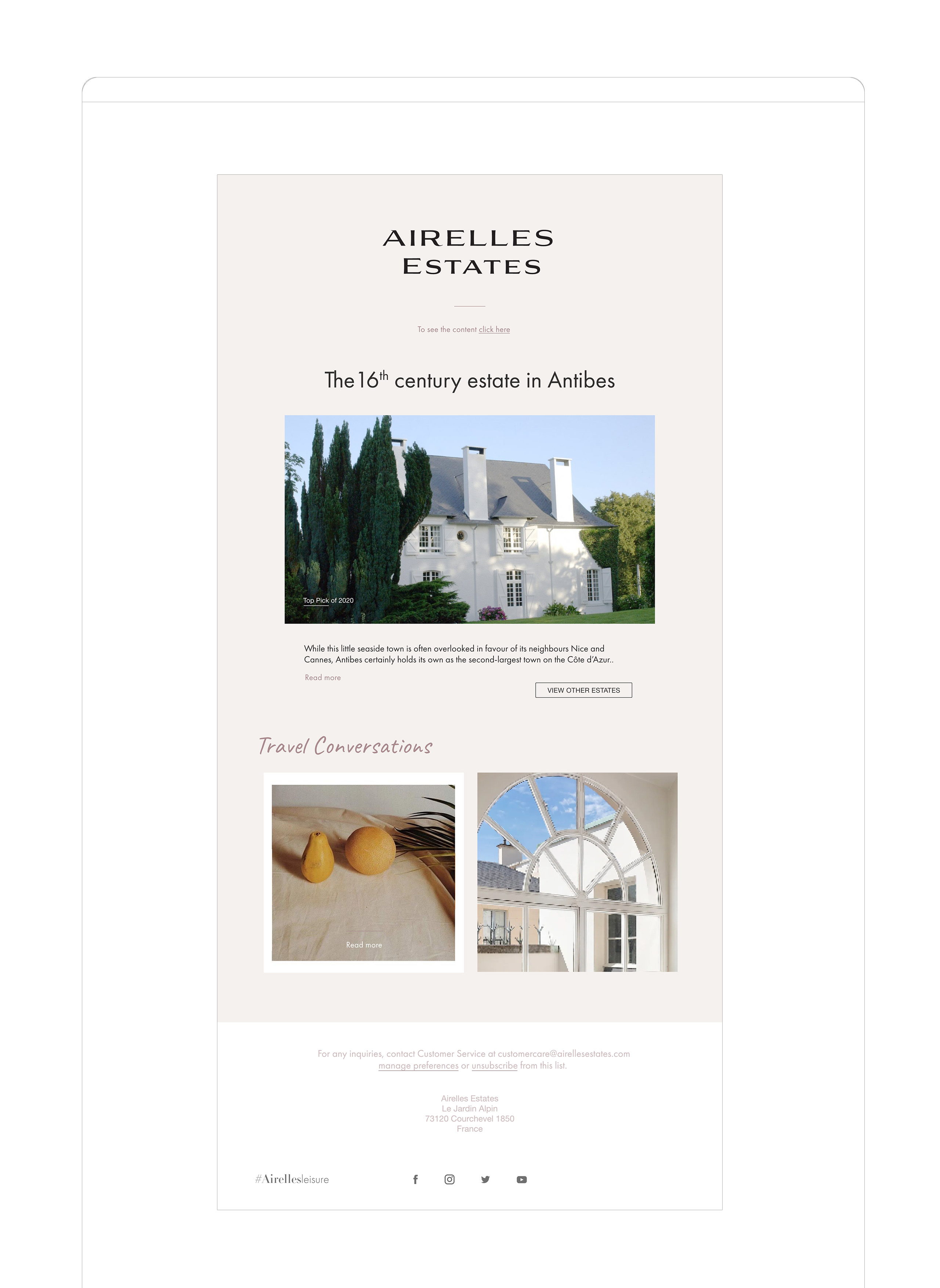
Imporant part of the communication is the digital newsletter, presenting the chosen travel stories and estates.

***
Other logo sketches

***
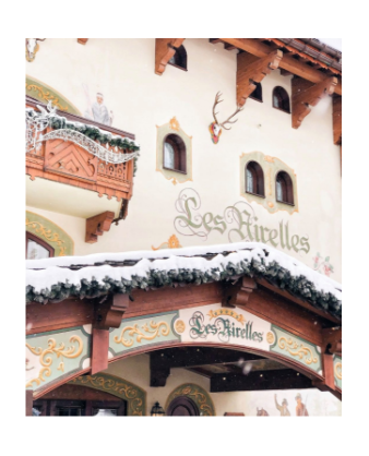
Airelles logo
based on the
cranberries,
the symbol of the Airelles Hotel.
the symbol of the Airelles Hotel.

Typography and graphic elements

Imagery
 Masterbrand colour palette
Airelles brand ( moodboard )

KIEHL’S
Product and brand visuals for the Kiehl’s brand signature repositioning campaign.
-> Role: Art Direction, Design
Creative Directors: Youri Guerassimov, Gaetan du Peloux
Creative & Copywriter: Olivier Dermaux, Gregory James, Xander Smith
Art directors: Jules Perron, Emilie Ramain, Agata Sienkowska
Agency: Marcel (Publicis Groupe)
Client: Kiehl’s, 2021
Brand Repositioning Campaign
The main objectives of the campaign were to show the unrivalled efficacity of the Kiehl’s products coming from science and to reinvigorate the communication about the brand’s heritage so that the brand is attractive also to the young and demanding consumers.

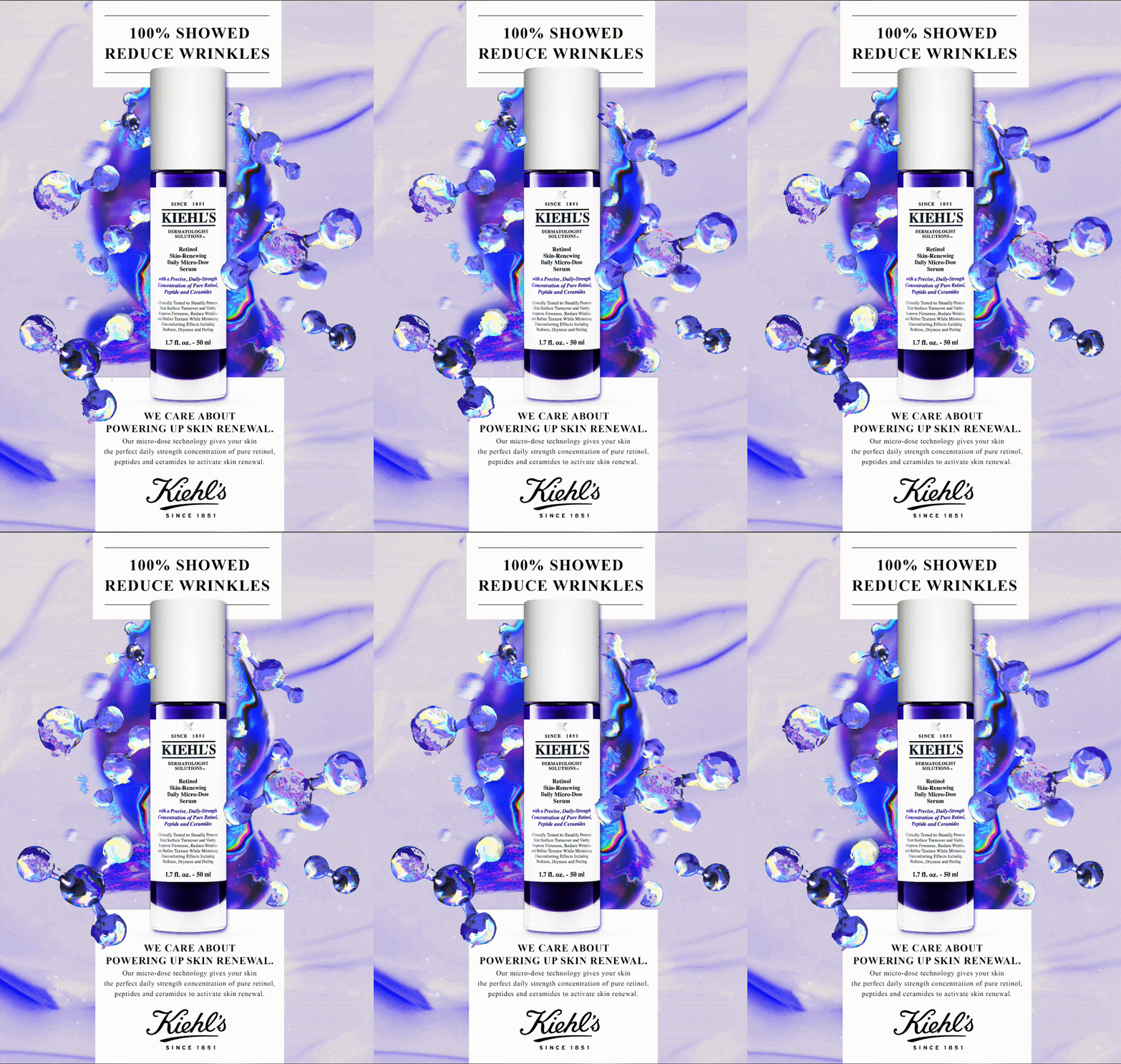
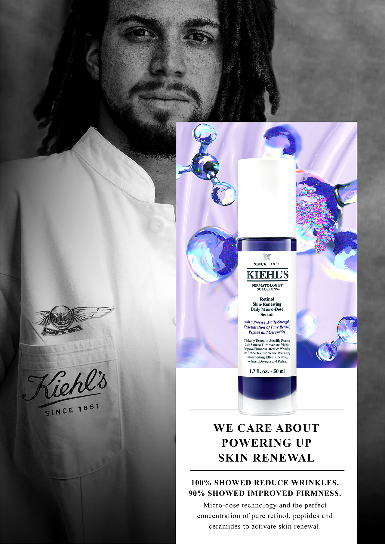
At the heart of the Kiehl’s brand heritage is the deep knowlegde and expertise about skin care. To bring these values in a powerful way to the international audience and modern consumers, the campaign was based on a series of product visuals and portraits of the Kiehl’s beauty consultants coming from different cultures and generations.

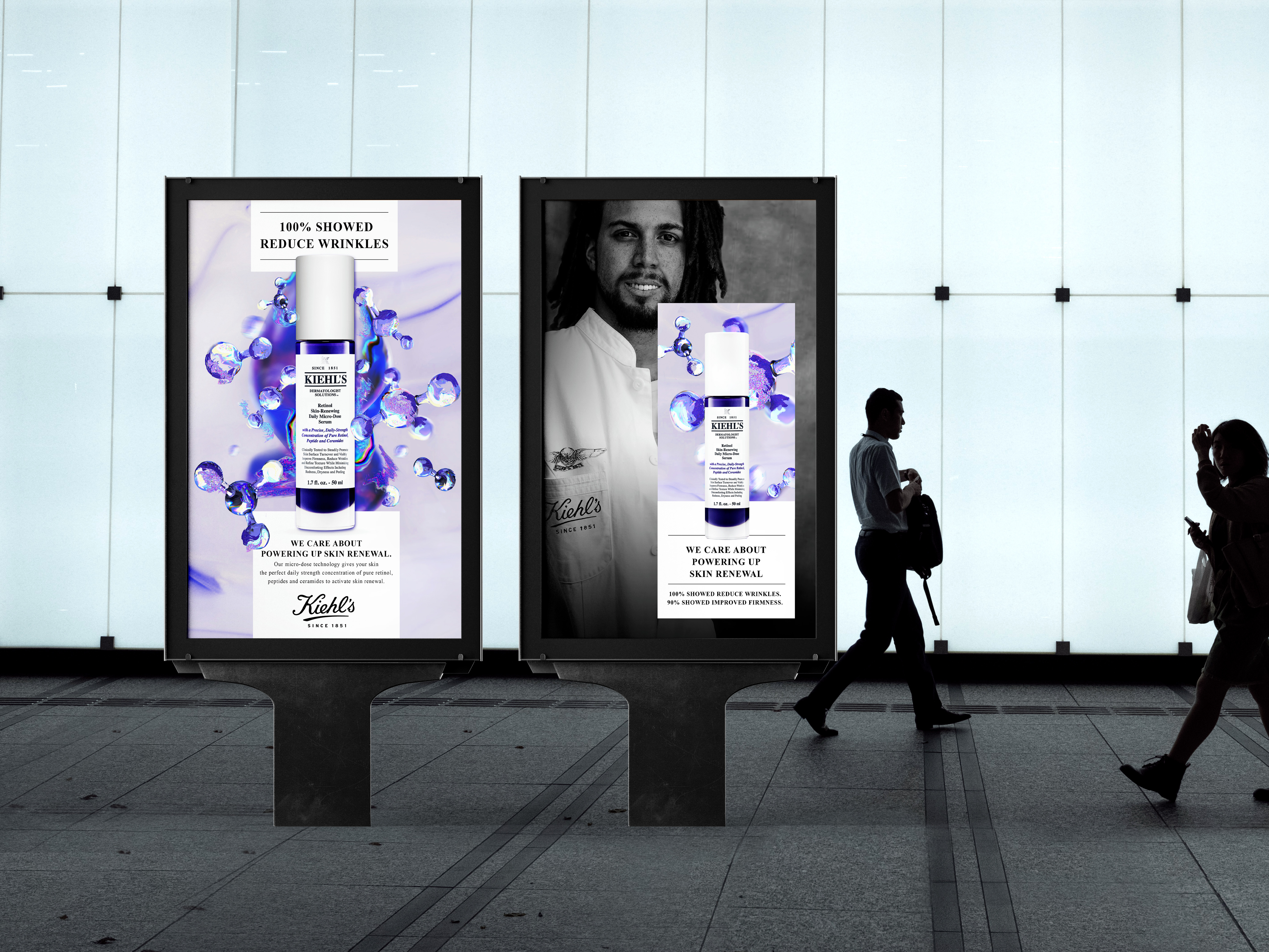

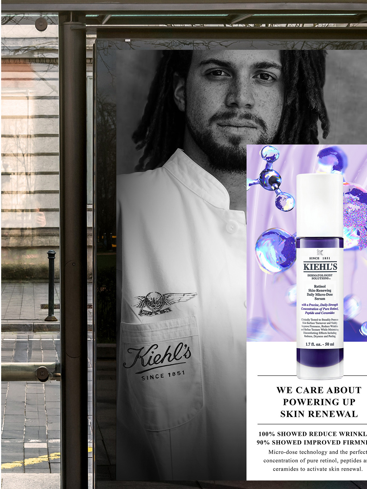
Immersive Beauty Experience
Important part of the project was to create an immersive world of the Kiehl’s products, ingredients and expertise with impactful point of sale materials and digital outdoor visuals. The examples presented above are prepared for the Kiehl’s Retinol Serum, one of the brand’s bestselling anti-age product.


LOU DOILLON 'LAY LOW' MUSIC BOOK
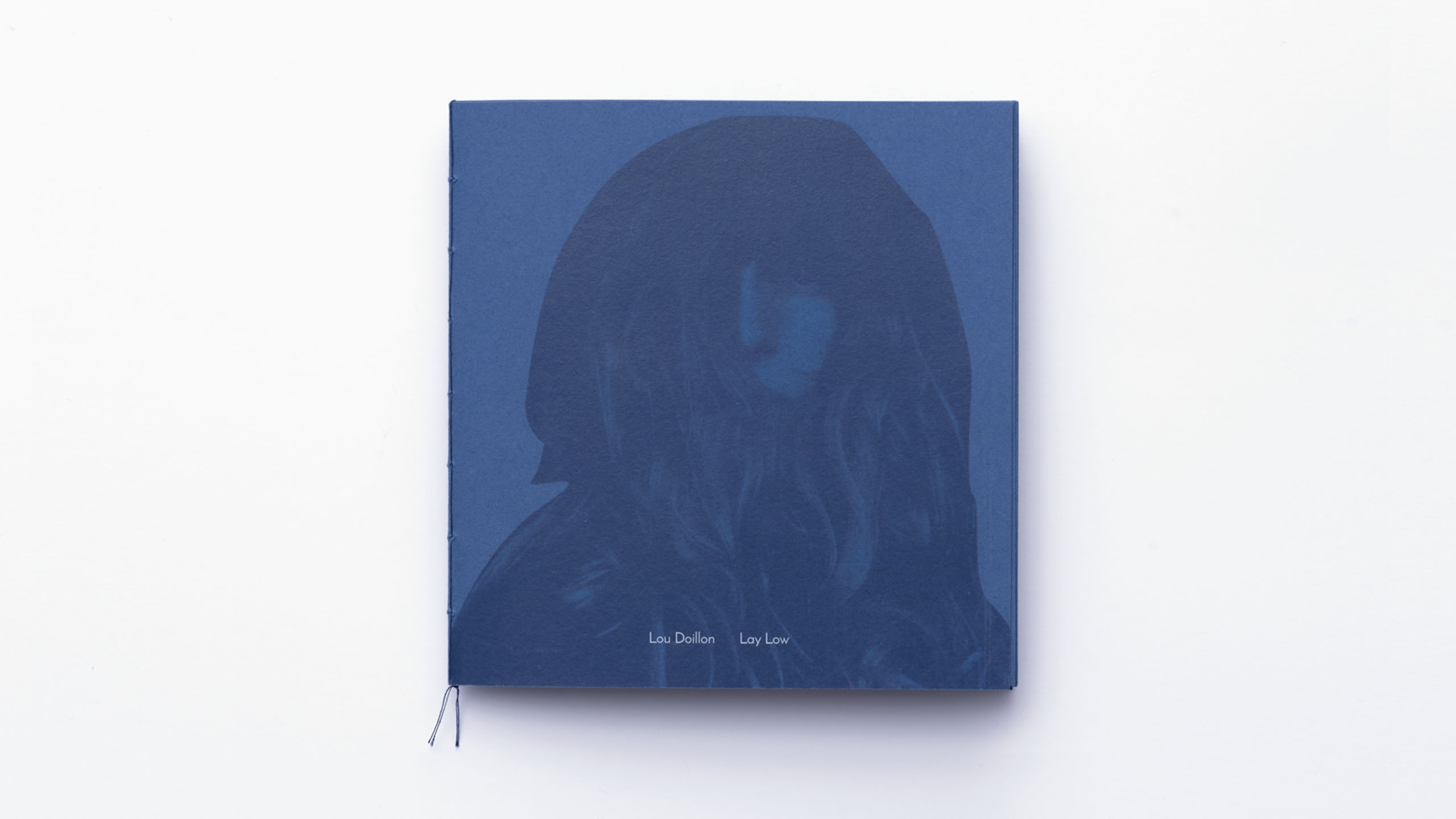
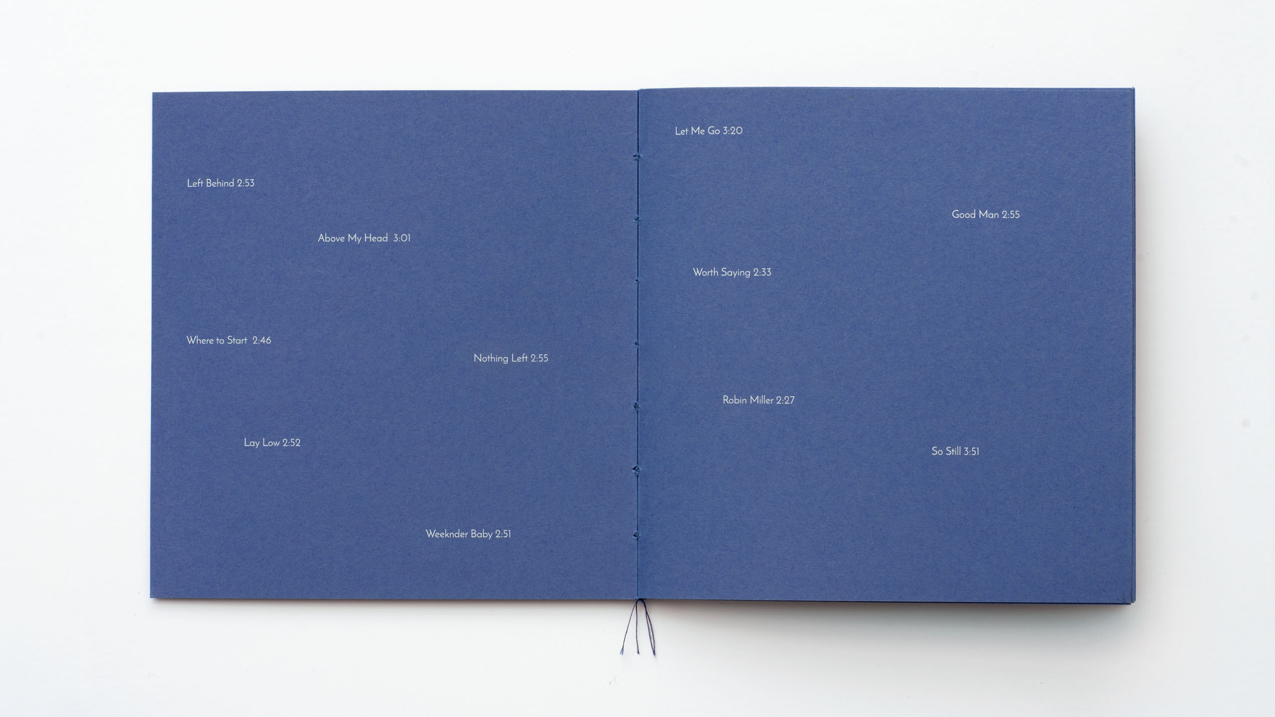
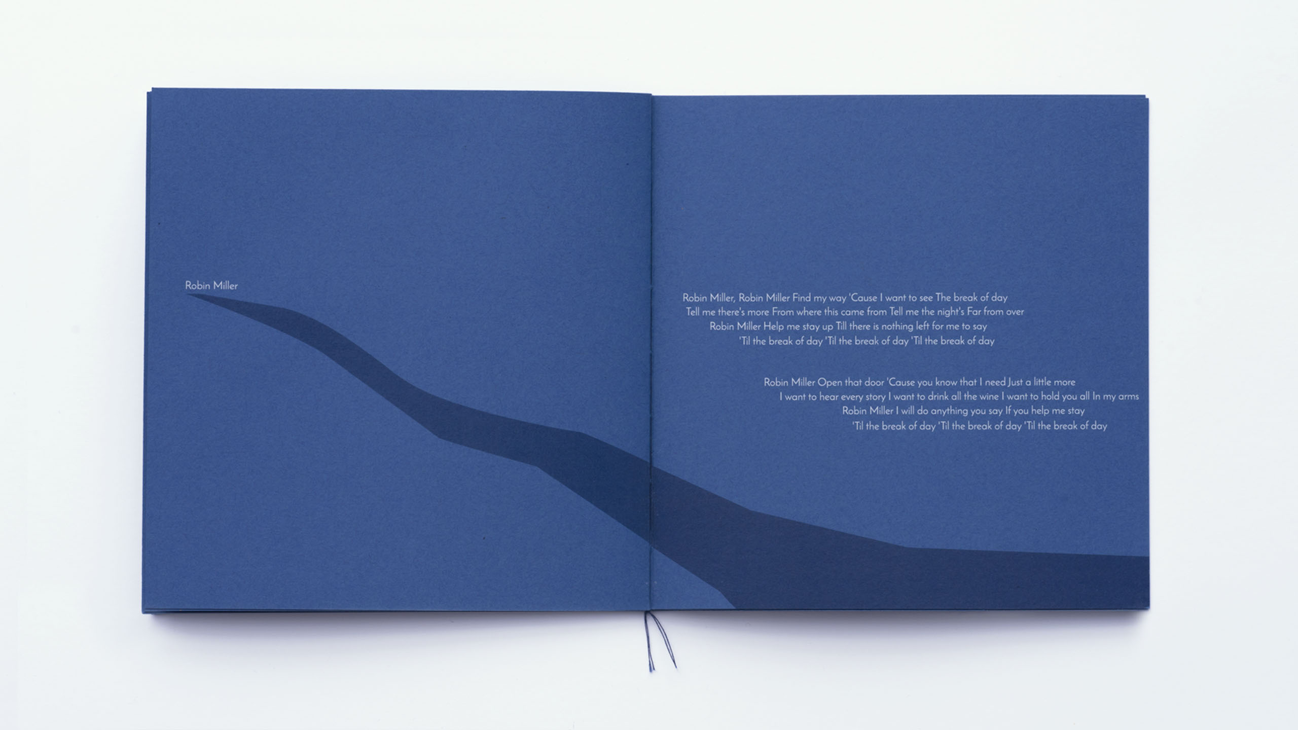
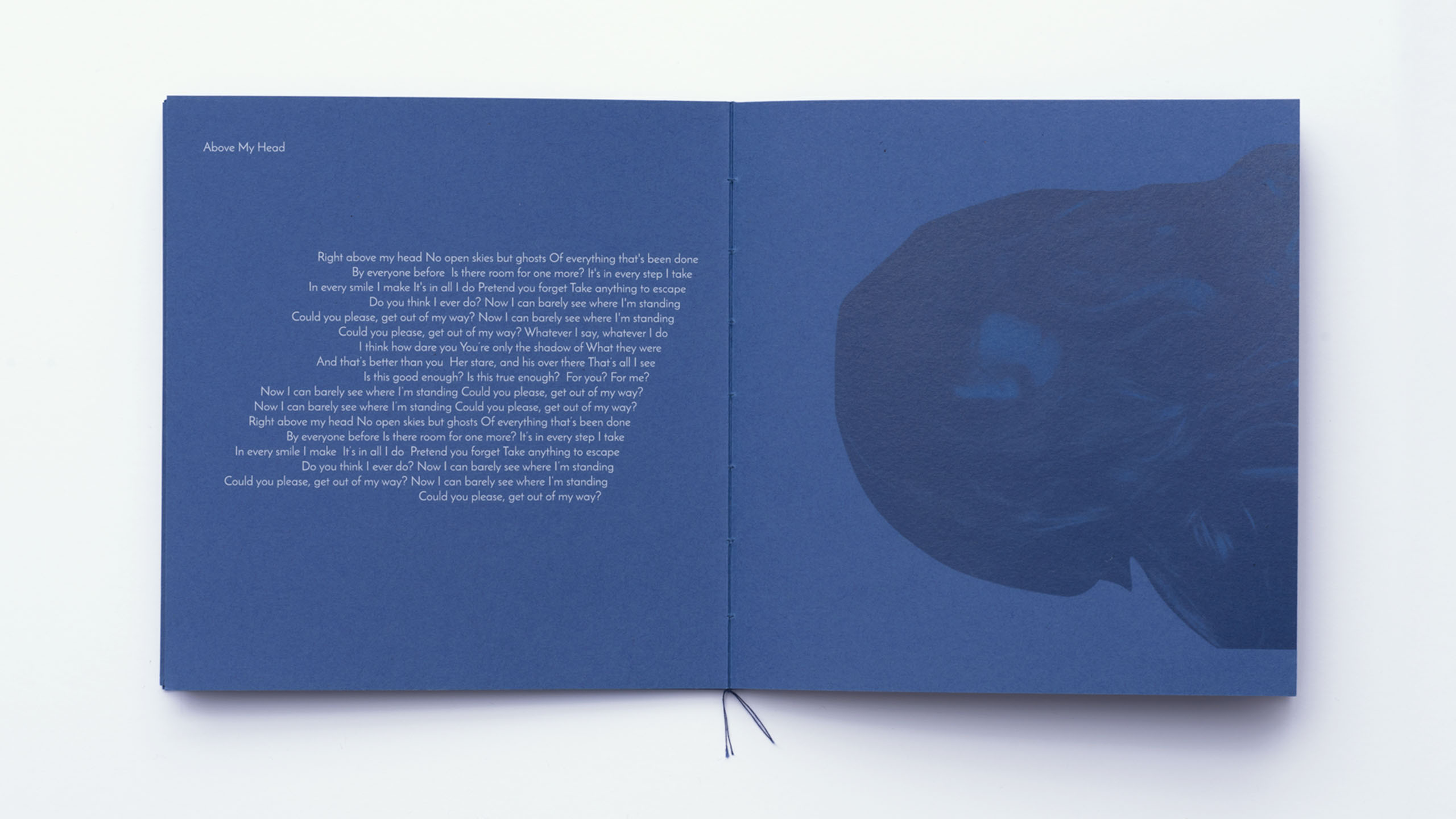
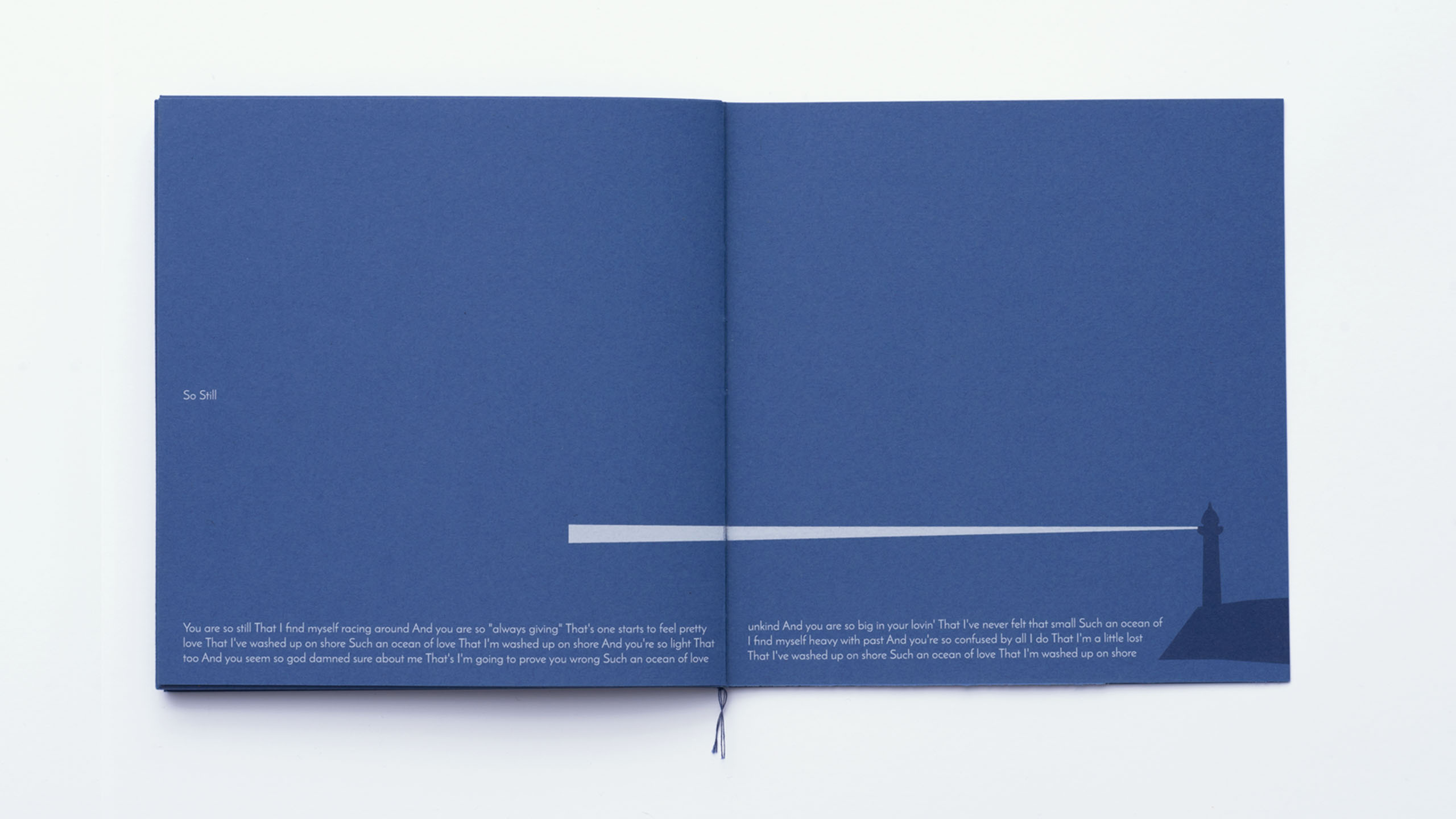
Design and concept of the music book added to the vinyl edition of the Lou Doillon ‘Lay Low’ album. The story and atmosphere of each song is reflected in the play of typography and illustration.
-> Role: Concept, Design, Illustration
Personal work, 2017

RITZ PARIS
Brand repositioning and digital
visual identity for the Ritz
Paris.
-> Role: Concept, Art Direction, Design
Client: Ritz Paris, 2023

Freelance Art Direction and Design for the Ritz Paris in February 2023. The nature of this work is confidential and can be shown only during a meeting.

VODA
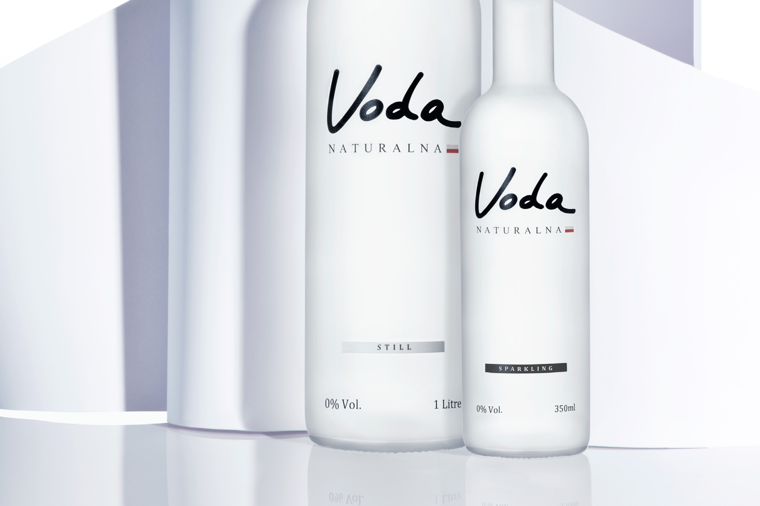
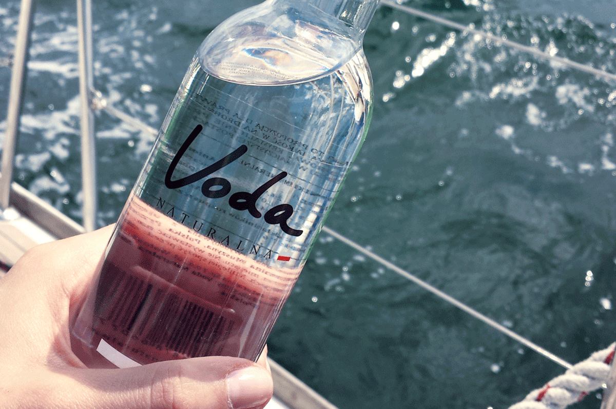
Brand repositioning of the Voda Naturalna premium spring water and new product launch campaign.
-> Role: Concept, Art Direction, Photography Direction, Brand Content
Design: Kacper Hauser
Photography: I Like Photo
Client: Voda Naturalna, 2015

Brand Repositioning Campaign
The campaign for Voda Naturalna was based on the print, social media and special sponsoring events, with an aim to present a more modern and artsy look and feel of the brand.
The campaign for Voda Naturalna was based on the print, social media and special sponsoring events, with an aim to present a more modern and artsy look and feel of the brand.


Digital Content
Digital Content
Creation of the brand content for social media focused on the comunication of the values of the brand. Some of the special events eg. regatta or art charity auctions that the brand was sponsoring were also covered.




Brand Brochure
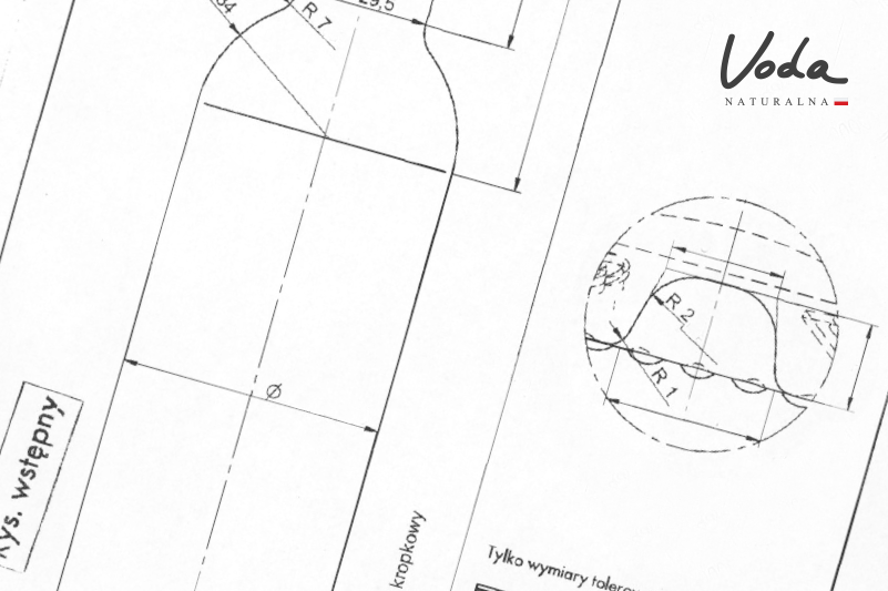
Creation of all the sales and market launch materials like brochures and leaflets with all necessary information about the product - brand story, the source and it’s quality as well as available packaging.


New Products Launch
An important part of the brand repositioning was the design and launch of the products in a lighter, plastic packaging, that is more comfortable for everyday use.

